Pages

Tuesday 30 October 2012

Maybelline Color Tattoo 24hr Eyeshadow in 25 Bad to the Bronze - Review and Swatch


The last time I reviewed one of these Maybelline Color Tattoo eyeshadows was in March. Crazy how the time passes. As I mentioned in that post, I bought 4 of these at the time as they were on sale for $5 and change from the usual $10-$11 Canadian. It was mere morbid curiosity and at that price, it would be educational if nothing else. Bad to the Bronze is possibly the best colour in the line. It is not a super warm colour, so it doesn't make me look tired when I apply it. When you swatch it, it looks super pigmented. When you run it across your eye, it does not go on very dark at all which may be a good thing given the colour. I have worn this with eyeshadow primer and it does last 14 plus hours and perhaps even 24 as the ad says. Sorry guys, I am not wearing this for 24 hours just to find out! It does look a bit faded to me at the end of the day, but not dramatically so.

I wore this product with no eyeshadow primer for a number of hours and I did not see any creasing happening. This product does appear to be crease-resistant. Below I have a swatch of Bad to the Bronze on the lower swatch and on the top swatch we have Bad to the Bronze with MAC's Bronze on top of it. It does make the eyeshadow appear more vibrant, I think. The nice thing about these Color Tattoo's is that you can just quickly apply it with your finger and you are out the door. I like wearing this on its own personally, add some mascara and/or eyeliner and you are good to go.

 
Given the price, I would say this colour is a solid buy. I would not trade this product for a MAC Paint Pot, price be damned. I find these tend to be a bit dry, the pigmentation so so and they look good on, but not fabulous. Mind you, Paint Pots do crease and this product doesn't so Maybelline has a leg up there. There are a couple of iffy ingredients in this. The full list of the ingredients is on Maybelline's website if any of you are interested. No parabens though.
 
Rating: 7.5/10 (the price boosts this score)


Sunday 28 October 2012

MAC Glamour Daze Collection - Impressions


I got this thick booklet in the mail the other day for MAC's 2012 Holiday Collection. Yeah, I know, I spend too much time at their counters. I was very excited when I got this because not only do I love new MAC collections, I LOVE MAC Holiday Collections. However, after thumbing through this booklet several times and also going to the counter twice to look at the products, I feel very underwhelmed. Today, I am going to go over the Glamour Daze collection. I will touch on the other holiday collections soon enough.


I have scanned pictures from the ad/booklet that I received in the mail. There are 8 eyeshadows in the collection. I know some bloggers are psyched about this collection, but I don't get why. Back to the eyeshaows - yawn. Most of them are very pale and frosted. Many look alike when swatched. The only two that looked like possibilities are Stolen Moment and Round Midnight. Stolen Moment is a greyed taupe and Round Midnight is a reddish brown. These colours are already sold out online and in some stores. There are three fluidlines. One, called Feminine Edge,a pink, had me excited until I saw it at the counter. I wanted to use the fluidline as an eyeshadow base. It is super metallic with lots of glitter. Certainly not what I had in mind.

The collection includes a False Lashes mascara and 4 eye pencils in standard colours. There are 5 lipsticks and 5 lip glasses. The only ones that appealed to me were the pink ones. The pink lipstick is a nice loud colour called Outrageously Fun. The lip glass, Pink Fade, is a nice soft pink. Both are sold out online. All three blushes did look nice. I believe these are sold out too online. I didn't get one because I already have similar colours. One is blue pink, one is a dirty peach and one is a rosey tan. There are two skin finishes and 4 nail lacquers. The nail lacquers looked like the Easter Bunny threw up. Maybe because it is Fall, I just can't get into the colours. To me, these colours are for spring or a confectionery theme. I just can't get on the bandwagon here.

If you are interested in this collection, and you can still get your hands on something, I would say that the blushes or lip products are your best bet. Like I said, I was underwhelmed and bought nothing. A few things of interest were already gone when I got there on Day 1.

Collection Rating: 3/10 (this is for the blushes and a couple of lip products)  

Friday 26 October 2012

Origins Ginger Souffle Whipped Body Cream - Review


Hello! Sorry have been a bit missing in action this week. I had to go on a business trip for a couple of days, and before I knew it, the week was shot.

I got a tube of this body cream last Christmas as part of some Origins Holiday box set deal. Basically, I got it free since the cost of the box equalled the cost of the other items in the box if I had bought them on their own. A jar retails for $36 Canadian. My tube was 150ml and I still have lots left. If you don't like ginger, skip this product. This is a very spicy smelling cream and the smell lingers all day long. Whenever I wear it and I go to visit my mother, she complains that she doesn't like the smell. She says no one should wear ginger on their body. Maybe she is right. I am not crazy about the smell myself. The smell is powerful though and it does wake you up if you are feeling sleepy. It is a decent moisturizer, but it is not out of this world. It feels warm to me when I put it on and makes me feel a bit cozy. I believe Origins claims this body cream is relaxing. To me, this is a scent that you would only attempt to wear around Christmas or winter time. I wouldn't put this on in the summer. I would probably attract some insects or animals. I will not be repurchasing this item as I really don't love the smell and the tube I have will likely last forever.

Rating: 5/10

Monday 22 October 2012

MAC Eyeshadows Dark Browns - Review and Swatches


I need to get back to doing all of my reviews on my MAC eyeshadows and get the swatches up. I don't know about you guys, but I am an absolute freak when it comes to checking out swatches of eyeshadows online. Mostly, I like to see what colours look like next to other colours so I can assess how cool or warm they are and how pigmented, dark, light etc. So hopefully my little show and tell and each swatch will be helpful. I dug through my stash and I appear to have 5 dark browns. That is, MAC single eyeshadows. I have a few more browns in MAC duos and palettes, but since those are not necessarily "singles" and are not part of the regular line, I will show those another day. I promise to put some of the colours above, where applicable, next to those other "non-single" eyeshadows so you get an idea of the colours. You never know when MAC will do a repromote.....

Okay, so onwards and upwards. Sorry for the hodge podge picture above. I will let you know what the colours are from top to bottom and from left to right. I am only going to tell you what is on the two full lines you see above, not the colours that are cut off. We have Soft Brown (will show in the Light Browns coming up), Hush (not applicable to today's blog), blank space, Folie, Satin Taupe, Bronze, French Grey and Mystery. I admit that French Grey is a limited edition eyeshadow dating back to I think it was the Danse Collection in 2007. An oldie, but a goodie. I think MAC has brought out a similar colour since then in limited edition formats or perhaps even done a repromote. If anyone knows for sure, please leave a comment below!

The swatches below are from left to right: Satin Taupe, Bronze, French Grey, Foile and Mystery.


Satin Taupe is seriously one of my all time favourite MAC eyeshadows. It is in a class by itself and it is a cult favourite. There may be rioting in the streets if they ever discontinue this colour. It is a frost and is very cool toned. It's super soft and blends like a dream. It has a bit of silver and purple in it and it makes a great smokey eye or jazzes up any evening look. I don't love browns in general, but this is a must for anyone's collection. I have to do a Top 5 or Top 10 MAC eyeshadows list one of these days and I assure you, Satin Taupe will be on the list. Bronze is a favourite for most people. A lot of people like it, and it is a nice colour. It is not my fave because it is warm toned. I do use it though, and it is a good colour for anyone to have in their collection. Very smooth and blends well.

French Grey is a nice cool toned satin brown grey. I don't find that I reach for this colour often as it is a bit chalky, not the easiest to work with, and the pigmentation is so so. It is an unusual grey though and it looks fantastic in the crease when you want a defined, yet soft look. Folie is a red brown. Looking at this colour, at first, I thought I would have no use for it. I have seen Tiffany D use it in a bunch of looks and I was intrigued so I bought it. It is an unusual colour. Whenever I wear it, I am blown away by how flattering it is. It too is very smooth, has excellent pigmentation, and blends well. A must for my make-up collection.

Finally, we have Mystery. It is a satin dark brown. It almost looks black under some lights. It's kind of a brown black. It sometimes is a bit tricky to blend with, probably because it is so dark. This is a super pigmented colour. I have a feeling that MAC makes other dark browns that I would like more. Does anyone have any suggestions?

These are $14.50 Canadian for the pro palette refill and $18 in the single compact. They are $12.00 U.S. for the pro palette refill and $15.00 U.S. for the single compact. They are 1.5g or 0.05 oz. each.

Satin Taupe Rating: 10/10
Bronze Rating: 10/10
French Grey: 6.5/10 (points for being an unusual colour)
Folie Rating: 10/10
Mystery Rating: 8/10

Sunday 21 October 2012

Lancome Colour Design Eyeshadow Volcano Shimmer - Review and Swatch


Tiffany D has talked about this eyeshadow on her blog a few times, and as a result, I purchased it as I was intrigued. I do own a few Lancome eyeshadows. As a whole, they are not my favourite, but they are fairly decent. I can't remember what I paid for this, I think it was around $20 Canadian for this single eyeshadow. It was like 20x the points day at Shoppers Drug Mart, and I was hell bent on getting all of those points (for free make-up of course) so I didn't pay much attention to the price. The size of the eyshadow is 1.2g or 0.042 oz. It looks like you get a lot more product than you really do. To put this in context, MAC eyeshadows are 1.5g or 0.05 oz.


The packaging is kind of cool. This lid slides out. This colour, I have to say, is gorgeous. It does look slightly different in different lights. It can look grey, brown or purple, but mostly a combination of all of the above. It is very flattering and I would think it would be on most people. Not to toot my own horn, but it looks fabulous on me and works with a number of outfits and looks. There is a drawback. It has parabens in it which does not thrill me. I don't wear this colour too often as a result. I would wear it a lot more often if Lancome used better ingredients in their eyeshadows. All that being said, if you are not the type of person who is fussed by such things, this eyeshadow is amazing. It is smooth as silk and blends like a dream. It does not make you look bruised or tired like some eyeshadows in this colour family can. It is a nice, cool neutral shade.The colour is brilliant. Please see the swatch below.


Rating: 8/10 (points off for value for your money and iffy ingredients)

Friday 19 October 2012

Klorane Soothing Eye Make-Up Remover with Cornflower Water Sensitive Eyes - Review


Several months ago I did a blog post on a new Klorane eye make-up remover lotion that I found. I thought it was well priced, had a great dispenser, was softening and so on. The link is below:

http://mymakeupissues.blogspot.ca/2012/02/klorane-soothing-make-up-remover-lotion.html

Since I love the Klorane make-up remover that I bought, I saw this other one that they make and thought I would give it a shot. The bottle is only about 100ml and it cost me around $14 Canadian. I needed more eye make-up remover at the time and I was going away so I wanted something smaller that I could take. This bottle at $14 is obviously not the deal that the bigger bottle that I normally buy is. While I think this product is ok, it doesn't compare with the other one. The liquid in this bottle is blue and it's perfumed. I am not crazy about the smell. It feels a bit oily to me. I also don't find it takes off my make-up as well as the other one I have does. I was seriously disappointed. Klorane makes a couple of other eye make-up removers. I am not sure if I will try them after my experience with this one. I think I better stick with the Klorane eye make-up remover that I know and love - Klorane Soothing Make-Up Remover Lotion. The names are so similar and confusing, I know.

Rating : 6/10

Tuesday 16 October 2012

Sigma Dare Eyeshadow Palette - Review, Swatches and Dupes?


No word of a lie, I have been meaning to do this blog review for about 10 months. Why the delay? I hadn't tried all of the colours out yet and I really like to do that before I pass judgement. I have the Sigma Bare palette which I reviewed in one of my first blog entries.

Here is the link:

http://mymakeupissues.blogspot.ca/2012/01/sigma-bare-palette-review-swatches-dupe.html

Man, I took some bad pictures for that blog! I have come a long way I think. Let me know if any of you would like me to redo it. I do not have the Sigma Flare palette and I have no plans to buy it. The colours in the Flare palette are not unusual and that palette, like the Dare and the Bare, have parabens in them. All of the palettes are $35 U.S. on Sigma Beauty's website. I usually get a coupon code from Tiffany D's website to get 10% off when I buy something from Sigma.


From left to right we have Surrender, Grasp, Chase, Escape, Reveal, Catch, Shout and Vanish. I like Surrender, Grasp, Reveal and Catch the most. I am not a fan at all of Chase, Escape, Shout and Vanish. These last four colours are chalky - especially Escape and Vanish. Their pigment isn't great on these either. A dupe for Shout would probably be MAC's Chrome Yellow. Surrender is my favourite. It reminds me of a more plum version of MAC's Sketch. A close dupe for Grasp would be MAC's Paradisco. I can't think of a dupe for Escape and Vanish and trust me, you don't want to find some. These colours are not all that nice. Reveal and Catch are by far the most unusual and are great to have for Fall. I looked around for orange eyeshadows like these and I couldn't find much, which is why I ended up buying this palette. Reveal is a satin and Catch is a lighter matte orange. Please see the swatches, in order of left to right in the palette, below.


A handy dual-ended brush comes with the palette. You get a E20 short shader smudger brush and a E45 small tapered blending brush. The bristles seem a tad rough to me and are lower quality than the regular single purchase Sigma brushes. I haven't really used the brushes. Then again, you can never have too many brushes! I think you get more of your money's worth with the Sigma Bare palette. Those eyeshadows are better quality and the colours are more year around neutral. The $35 price tag is reasonable for the Bare palette but not for this one. Most of these Dare colours blend well and are smooth when applied. The packaging is chunky and gross. Four of eight of the colours in Dare are really poor quality. I think Sigma has shrunken the packaging on these palettes now. To be honest, as soon as I finish typing this blog I am going to pack this palette away and won't likely use it for quite a while.

Rating: 5/10 (for the unusual colour ensemble and the orange eyeshadows - very outside the box thinking)

Monday 15 October 2012

NYX Jumbo Eye Pencils in Milk, Horse Raddish, Pots & Pans and Purple - Review and Swatches


Today, I am going to review the four NYX Jumbo Eye Pencils that I own in 604 Milk, 607 Horse Raddish, 603 Pots & Pans and finally, 618 Purple. I have had Milk the longest and it is by far the most practical and useful. I will tell you why in a minute. The others I have acquired over the last couple of years. They are very creamy and do not seem to harden or "go off". I keep mine in a dark, dry drawer in my vanity table. I don't think I will ever finish one of these pencils. You don't need much product when you use them and I don't reach for mine all that often, but they are handy to have. They retail for around $3-$5 U.S. and Canadian. The only place I have seen these for sale in Canada is at Lovell Drugs and sometimes Rexall or Pharma Plus has them. In the U.S., I think they are a dime a dozen and you can get them at many major drug store chains. I haven't seen them in Walgreens though and I have checked in a few states. Someone please correct me if I am mistaken.

For those of you who are not familiar with this product, basically they are a creamy eyeshadow base. I suppose you could wear them alone as eyeshadows if you wish, but I don't know anyone who does. Like I said, they are super creamy and they crease like crazy. I don't care how dry your eyelids are, you need eyeshadow primer with these puppies. The idea is that you rub some on your finger or use a MAC 217 brush to apply them to you eyelid up to the crease as a base and then pat eyeshadow on top of them. You will need to blend out the edges once you have applied this product. A little goes a long way so start small and build. They intensify eyeshadow and give it a sticky base to cling to so it does not wear off easily. Milk is my fave. At $4ish, it is hard to go wrong and if you are on a budget, you can easily afford to collect a few here and there. A cheaper alternative to MAC Paint Pots, but they are not as good. The NYX Pencils do have parabens in them and some other funky ingredients. As a result, I don't use them that often.

Anyway, as I was saying about Milk, it is great for using under nude colours or pinks or ices as it gives you a glowy doll eyed look or big eyed look if you prefer. It really makes your eyes stand out. Please see my swatches below:

                    Milk, Horse Raddish, Pots & Pans and Purple

Not a lot of companies make a white eyeshadow base which is why Milk is a good one to get. Horse Raddish is a decent option too especially when it is St. Patrick's Day and you have a green look you wish to sport. Pots & Pans is a light silver, and while it is a great colour to have, other companies make similar eyeshadow bases with better ingredients, but also those other company's products usually come with a heavier price tag. The Purple is my least favourite of the bunch. The pencil itself looks navy and it has a weird sheen to it. It doesn't look great with a lot of purple eyeshadows. The next NYX Jumbo Eye Pencil I am planning to acquire is Strawberry Milk. I hope this was helpful for you all!

Overall Rating: 9/10 (minus 1 for scary ingredients)

Friday 12 October 2012

Estee Lauder Sumptuous Extreme Mascara Lash Multiplying Volume Mascara - Review

I was so excited to find this! I love, love, this mascara. I always have great difficulty finding a good mascara and this one really hits the mark. This product retails for $28.50 Canadian and is $25 U.S. Not cheap, I know. I actually started wearing Estee Lauder foundation a few months ago and when I went to stock up, they gave me a free mascara. I tossed it aside, as I wasn't expecting much. For example, I have tried almost all of Lancome's mascaras over the years and they are crap. I have no idea why Lancome hypes up their mascara so much. I highly doubted Estee Lauder was going to impress me.

So I recently went away on a cruise and took this mascara with me as a back up. I tried it out several times and I was really impressed. I have 01 Extreme Black. At first, it just seemed ok when I put on one coat, but then I  added a second and third coat and my lashes were long, volumized and curled! Even after wearing this mascara all day, seriously 15 hours later, they still looked great. The length, volume and curl hold. This is seriously up there with my Benefit They're Real Mascara. I am not sure what the ingredients are in this product. I will find out and let you all know. There is zero flaking with this product and I have not had an issue with clumping. I always have smudging issues with all mascaras when I wear my glasses and I have to say that although this one does smudge a little when I have glasses on, it smudges the least of any mascaras that I have tried. I have no smudging issues with this mascara when I wear my contact lenses. The wand is huge, which is usually a bad thing for me, but it is surprising easy to work with as it is tapered.

Rating: 8.5/10 (price is steep and it still smudges a little with glasses)

Wednesday 10 October 2012

Lise Watier Quatuor Millesime Fards a Paupieres Eyeshadow Quad in Les Vins - Review and Swatches


Wow, the title of this product is long. Too long. Lise Watier (LW), for those of you who don't know, is a Canadian company which, if I am not mistaken, was founded by Lise Watier. Makes sense. Their headquarters are in Montreal, which is in the French speaking part of the country. Canada is bilingual. That being said, most of the country speaks English and since we have two official languages, it would be nice if Lise Waiter would indulge the masses here in Canada and put more English on her products and packaging. That's my beef du jour (of the day). LOL. Some of you won't get that or might be ticked off regarding what I said but I am being honest - sorry!

Anyway, back to Lise and this eyeshadow quad. The above picture is the look that Lise Watier has put together to showcase this palette. I snipped the pic from their website and the picture is in every magazine in the country right now that has beauty ads. I fell in love with this look and simply had to have it. It is very unlike anything I have seen marketed in awhile. This is the link for how to get the look: http://www.lisewatier.com/eng/Getthelook/GTLMillesime.cfm


Lise Watier, you can thank me for the free advertising later. The quad is a bit chunky, as is all Lise Watier packaging , but it looks nice. By the way, I am wearing this quad in the picture of myself on the front page of my blog. I realize my eyes in the pic are too small for anybody to be able to see much detail. Sorry for that. Just an FYI. The reason I bought this was because I loved the colours and the combination of them. Just beautiful. My hope is to be able to replicate this quad with other colours from my collection or sub some out with identical ones in the future. This is part of the reason why I am a makeup collector. If I like a look, I will buy the colours (if say I am not crazy about the product) so that I have a reference for what I am looking for in the future and so I have a record of what a certain look was. This way, no one can fool me with repromotes and the like. Expensive hobby? Yes. I am not necessarily proud of this.


Some of you are probably wondering why in the world would I want to find a match for these colours if I already have them. Good question. I think you know where this this going, but it is not as bad as you think. Essentially, I want to use higher quality eyeshadow to replicate the look. I will still use these in the meantime. I am not daft.

The darker colours are nicer than the lightest one which LW refers to as rose gold. That being said, the rose gold has a certain je ne sais quoi. There I go again with the French...sigh. It's just that theme and time of night I guess. I don't have another colour like it and it really pops and glows over a violet or red base. It is chunky and chalky though. The fallout on these colours was a bit crazy. I had forgotten what fallout was for awhile there until I used this quad a couple of weeks ago. All 4 do blend well though and some are smoother than others. My props on this has to be on the colour ensemble (not again, I can't control myself...sheesh). The cost is $36 Canadian for the quad. It comes with two dual-tipped useless applicators and the ingredients are not too scary. Total product weight is 5.5g or 0.19 oz. which is decent for the money. I love, love, love the vineyard theme. I will let you know if I come up with dupes. The grey colour looks the easiest to replicate. I probably have 5 dupes of this colour in my collection alone. The rose gold is more "rose" in reality than on the swatch below. The show stealers are the blue violet and the red violet colour. I also bought an eyeliner from this collection, but I will do a review on it separately.


Rating: 7.5/10 (the price is good, colours/theme are gorgeous but the quality is lacking a bit)

Tuesday 9 October 2012

Bobbi Brown Corrector in Light Peach - Review and Swatch


I bought this product a little while ago as the Pixiwoo girls have been using this in some of their tutorials and they seemed quite pleased with it. I am eternally plagued with dark circles under my eyes and I cannot escape them. I have what I like to think of as the triple dark under eye curse - the triple threat if will: genetic tendency, don't sleep enough and I tend to be slightly anaemic. I have decided to live with it as best I can and cover it up as much as possible.

The idea behind this product is that by using a peach corrector, it helps to neutralize the "blue" under your eye and then you layer a concealer over it. This product by the way is $23 U.S. and is $30 Canadian. That is some mad cheddar for what I think of as half a product. You can not wear this on its own. Trust me, I tried. The peach does blend in well and you can't see the peach colour once you have finished, but it is not enough on its own. I can't explain it, but it looks funny without anything over it. I thought I looked a bit skeletal under the eye if that makes any sense. I guess your skin tone is just not blended looking or something. I do think it helps cover some of the "blue" and I like the formula because it is very creamy and does not crease under your eye. It isn't dry like a lot of under eye products. There are 4 peach correctors in the Bobbi Brown line. I chose the second to lightest as this shade is darker than my skin colour. I think it might be a bit much to go any darker, but if any of you have any experience with this product and the peach colours, let me know. Please see the swatch below of Light Peach.


You don't get a lot of product either. The compact is super small at 0.05 oz. or 1.4g. I have been wearing this product with some of my concealers over it, but the hilarious thing is that I have been very bird brained about something. I actually own a yellow Bobbi Brown concealer which is supposed to be used on top of this product. I haven't used the two together yet! Is that crazy or what? I think I need to have my head examined. Okay, I will try the two together this week and update this post I promise!

I do "get" this product. I will likely purchase this again. I think part of my problem is that I haven't found a yellow concealer that I love. I have a few that are ok (including the yellow Bobbi Brown concealer). Maybe the two together will be the magic formula. Okay, I will suspend a rating judgement on this one until I try both together. Is that fair? I think so. Stay tuned....

**Update: I have been using the corrector and the concealer together for a week or so and yes, they work together well. I would prefer more coverage overall though, but they aren't bad.**

Rating: 7/10

Sunday 7 October 2012

Makeup Geek MUG Eyeshadows Country Girl and Razzleberry - Review and Swatches


I promised you guys ages ago to do some more reviews on my Makeup Geek eyeshadow collection. I got a bunch of new ones back in the spring and I have still not tried all of them! Too much makeup, too little time! Sigh...So I finally got around to working with two - Country Girl which is on the left above and Razzleberry on the right. Same order below on the swatches.


I knew I would like Country Girl before I even tried it. The colour is, to me, a kind of rose brown. It is unusual and I haven't seen anything like it. Makeup Geek describes it as shimmery pink brown. It is unlike any brown you probably own. MAC's Folie is a red brown, whereas this is a pink brown. It is smooth, easy to work with, quite pigmented and not chalky. I will keep this one handy for when I want a "different" brown look. It works well with creams, golds, darker browns etc. I do not find it shimmery at all though. It's quite matte on. It sells for $5.99 U.S. for a single refill pot or $7.99 for it in a compact.


I am wearing Razzleberry above. I won't lie to you guys, this one was a big disappointment for me. I was actually saving this one to wear on a hot night out. I decided to try it at home first which was wise. If there is one thing I have learned, try new makeup out on a dry run. Don't save it for a major event or big night out before you try it as it may not look the way you want it to or you might find the colours aren't quite right or work well and so forth.

Razzleberry is described by Makeup Geek as raspberry pink with gold glitter. I would describe it as matte raspberry pink. The colour looks like a million bucks in the pan. It looks awesome on Makeup Geek's website and they say it is one of their more trademark or unusual colours. I want a dress this colour - the way it looks in the pan, all sparkly and stuff. When I swatch it, a little of bit of glitter shows up. Not much and compared to what it looks like in the pan, it is night and day. When I apply it, there is no gold glitter anywhere to be found. The colour is completely matte. I was seriously blown away in shock. When worn on the lid, MAC has an almost identical colour to this called Post Haste I believe. I think Post Haste is hard to get or comes out in limited editions from time to time. The effect is the same though so I don't really find this colour so unusual. The pan looks awesome in my Z palette though!

In Razzleberry's defence, it is smooth, easy to work with and is not chalky. It is very pigmented and bright, just forget about the glitter as it is invisible on.  It sells for $5.99 U.S. for a single refill pot or $7.99 for it in a compact.

Country Girl Rating: 9/10
Razzleberry Rating: 6/10 (it's too disappointing)

Saturday 6 October 2012

Benefit Cosmetics Bella Bamba Blush - Review and Swatch


I got a 3g Bella Bamba container from Sephora with some of my rewards points a few weeks back. I think I have tried almost every blush that Benefit sells, so I thought what the heck. I like this one more than Coraslista. Bella Bamba reminds me of Coralista actually, but this is like a medium pink version of Coralista. This products also reminds me of Nars' Orgasm, only Bella Bamba is much more vibrant and pink. It is described by Benefit as a watermelon pink and sells for $36 Canadian and $28 U.S. A regular sized box is 12g. Considering I have never, ever come close to finishing a Benefit boxed blush, I think the 3g one that I have will last me a very long time indeed.

 
On the swatches below I have Bella Bamba on the left and Coralista on the right. I realized when I looked back on my blog for Coralista that I took a pretty crappy swatch photo so hopefully this will make up for it! Sorry! 
 
 
The product is nice and smooth but a bit glittey and is slightly chunky. It looks so cool in the container. On my skin tone, I find Bella Bamba to be more flattering than Coralista is, but both have their purposes depending on your outfit and the season etc. I think Bella Bamba would look great in the middle of summer or even in the winter if lightly applied. I really like this one. The price in Canada is brutal though but you get tons of product. A Benefit box of blush has twice the amount of product of a MAC blush. Is that crazy or what? I am glad mine was essentially free. Thank you Sephora and good job Benefit!

Rating: 9/10

Friday 5 October 2012

MAC Marilyn Monroe Collection Impressions and The Perfect Cheek Blush Review and Swatch


Hello everyone! I must have been living under a rock or something, because I went onto MAC's website last weekend and lo and behold I see that the Marilyn Monroe collection was already out online and for the most part, sold out. I knew the collection was coming, but I thought it would be closer to Christmas or something. The collection was released in stores yesterday, October 4th. I ran to The Bay on my lunch hour to grab what I could. They were already sold out of 2 of the best lipsticks and a bunch of other things. They told me most of the stores in Toronto and Kingston area were sold out of most things by 10-11am. Crazy! So before I break down my thoughts on the collection for you and do a review of the one product I did get, I think I should say a word on Marilyn.

Ever since I can remember while growing up, Marilyn Monroe was a Hollywood legend. I used to not get it, not nderstand what all of the hype was about. I mean this was a woman who died long before I was even born. "Why do people adore and immortalize her?", I would wonder. I have seen snippets of a few of her movies, and not to be rude, but I didn't think they were very good. She came off as most ditsy. Then again, so did a lot of film stars at the time. In my older age, I am starting to understand the fuss. It is not that she was such a wonderful film star, it was that she had such a timeless, classic Hollywood look. Her makeup looks never go out of style. She is famous and infamous for being a fashion and beauty icon. The fact that she died young under a tragic circumstances and led a lonely life at times only add to the enigma that she has become. If she had lived to see old age, she wouldn't be such a big deal now I would guess. Once again, I digress.

Back to the makeup. I think overall MAC did a great job with this collection. I hate that they never produce enough products though for any of their releases. Hardly anyone can get their hands on the good stuff. There were 3 lip liners in the collection. They are all permanent products so that was nice to see. That fact also made me not buy any since I can get them anytime. I already owned one anyway. They are Beet, Cherry and Redd. All of these go great with a red lip. MAC also jacked up the price of these since they made the pencils a bit shinier for this collection. That was also a deal breaker for me not to buy any of them now.

There were two blushes: The Perfect Cheek (the one I bought) which is a pink neutral beige in a matte finish and Legendary which is a pale soft coral in a satin finish. I really liked the look of Legendary, but I have so many similar blushes that I decided to pass. I don't have tons of matte blushes in soft neutral pink beige so that is why I bought The Perfect Cheek. It is a really nice colour and it is not like anything I have. It really brightens up my face and it will be good for winter looks. It is very soft and classic looking. I can totally picture Marilyn wearing this colour. It was $26.50 Canadian and is $22 U.S.


In the swatch below, I have MAC's Blushbaby on the left, The Perfect Cheek next in the middle and beside that The Perfect Cheek blended out on my arm. I was thinking that The Perfect Cheek was a lighter shade of Blushbaby, but when I got it home I realized that Blushbaby is more brown.


The collection has a Beauty Powder in Forever Marilyn which is a peach highlighter. It looked a bit chalky to me and I have tons of highlighters already that I don't use much so I passed. I hear it is nicer on that it looks swatched. There are 5 Nail Lacquers or Polishes if you prefer. Three are reds, one is coral and one is golden. Two of the reds are permanent shades. They are all nice and I can see Marilyn wearing them. The collection has 1 set of lashes, some brow stuff, the black Penultimate Eyeliner (you should read my previous review from months ago on that!), two eye kohls (a black and a white which are part of the permanent collection), False Lashes Mascara (which I still haven't tried) and two clear glittery dazzleglasses. I don't like dazzleglasses so I passed on them.
 
The five lipsticks were gorgeous. I would have snapped them up, but the two I really wanted were already sold out when I got to the counter. Deeply Adored, one of the reds, was to die for. There are 2 dark reds (Charmed I'm Sure, Deeply Adored), a pink red (Love Goddess), one coral red (Scarlet Ibis) and a nude shade (Pure Zen). I really hope they bring them back someday down the line. Finally, there were 4 eyeshadows. This is the only area where I think MAC dropped the ball with this collection. They are How to Marry, Preferred Blonde, Silver Screen and Showgirl. None are at all that Marilyn in my opinion. No crease colours at all. Three are icy frosted numbers, easily duped by anything similar you have in your collection. The fourth is a blue shade. No one was really buying them when I was at MAC yesterday and beauty bloggers seem to be in agreement that they are not very special or great. I took a big pass on them. So that's it and I have babbled enough. Have a wonderful Thanksgiving to my Canadian readers!!!!
 
The Perfect Cheek Rating: 10/10

Thursday 4 October 2012

Laura Mercier Kohl Eye Pencil Black Gold - Review and Swatch


I have been playing with the look of my blog lately as some of you might have noticed. Ever since I started my blog, I must say, I have never been happy with the look. I find blogspot has a limited number of suitable backgrounds and layouts, but maybe I am just being picky. Anyway, once again I changed the look. Sorry if I am throwing any of you off. I would love to hear what you think of the new look. Is it too washed out?
 
On to the makeup. I got a bunch of free Laura Mercier goodies a few weeks ago from Sephora as one of the rewards things. I have never bought anything from Laura Mercier before so I am a Laura Mercier virgin if you will. Time will tell what I think about their products. I gave the eyeliner a whirl first. This is one of the kohl eye pencils in the colour Black Gold. If it was up to me, I would simply call it "smoulder" because that is what it looks like and that is what it does. It's described as "Black Gold". Surprise, surprise......I think it is more of a dirty gold with black and brown in it. This eye pencil is very soft and glides on like a dream. It looks good, and not heavy looking, on either the upper or lower lash line. I think it is perfect for work actually as it is not a harsh colour and it blends in well with your mascara and lash line. It adds a certain je ne sais quoi. It makes you look a bit done up, meanwhile you made hardly any effort at all.


Frankly, it goes with most outfits which is sweet too. All purpose products which are no brainers are my favourite. I can tell you right now that I will definitely buy one of these once this one runs out. You can smoke this out too if you like but you don't need to. It does smudge a little on its own, but I think that is part of its charm. This is both an acceptable feature and a wanted one. It looks great smudgy. It does not look dirty on at all which products like this sometime do. Winner, winner, chicken dinner. One of the best features is that you don't have to be precise when you apply it. It looks great just thrown on. I did notice it faded a little after about 8 or 9 hours. At the 15 hour mark, it is still on, just a bit faded but it doesn't look stupid at that point which is good. This product is $20 U.S. and $25 Canadian which I think is pricey. That and the slight fading are the only drawbacks.

Rating: 8/10
Wednesday 3 October 2012

Tarte Clean Slate 360 Degrees Creaseless 12-hr Smoothing Eye Primer - Review


I promised you guys a review on this, and seeing as I just discussed the Too Faced Eyeshadow Primer yesterday, this only seems appropriate. Today, we will discuss Tarte's new Clean Slate 360 Creaseless 12-hr smoothing eye primer. So as some of you know, I bitched, whined, sobbed and belly ached about Tarte discontinuing their Lifted Primer recently. Why a company takes a perfectly good product and tinkers with it, I will never know. I mean the product was just becoming huge! Sheesh! Tarte, if you are listening, you made a very bad move! I promise to email you and complain about it again too! Okay, first of all lets get the 411 done on this puppy. This product is $19 U.S. and is $25 Canadian. I believe Lifted was the same price. This new product has 11g or 0.39 oz. of product. As a reference point, the Too Faced Shadow Insurance 11g or 0.35 oz. Lifted is 3.5ml or 0.11 oz. Okay, with Lifted you get less product, but it was a better, creamier product and you didn't need much.

So this new product does exactly what it claims to. Use it and your eyeshadow will not crease for 12 hours. Exactly 12 hours. I have tested this day after day. At about the 12 hour mark, a tiny crease in the inner area of eye slowly starts forming. So Tarte hasn't lied. What ticks me off is that Lifted lasted well over 12 hours with no creasing! I don't know about you ladies and gentlemen, but my day does not stop at the 12 hour mark. I am just getting home from work! Heaven forbid I should want to hit the grocery store or go somewhere without needing to completely reapply my eye makeup! Arghhhh Tarte why have you done this to me!!!!

This product is head and shoulders above Too Faced's Shadow Insurance but it is not Lifted. Am I still going to buy this? Sigh...yes. What choice do I have? It is still the best thing going. It is a white watery substance that blends completely into your eyelid colour. It reminds me a lot of the Shadow Insurance stuff. I am not crazy about the packaging, but it is small and convenient.

Rating: 8.5/10 (and this pains me)

Tuesday 2 October 2012

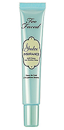
Too Faced Shadow Insurance - Review

This blog post is way overdue. Eyeshadow primer is one of the staples of any makeup bag. Without it, I am lost. Let me start off by saying that my personal favourite eyeshadow primer is made by Tarte. This Too Faced one is the one I reach for when am in a rush and can't locate my Tarte one or if I am only doing my makeup for a few hours of going out. This does work and it works well for the most part. My only complaint about it is after several hours of wear, I find my eyeshadow looks faded, bordering on transparent in my crease. There are no creases though! Since this is not ideal, this eyeshadow primer is hence, not my favourite. I don't have the faded crease issues with my Tarte primers, even after 10 plus hours of wear. I would say this product works up to 6 hours well but after that it is slowly downhill as the fading starts. This tube lasts forever. I have had it for a long time and I have barely used any of it. The product is a nude skin colour and blends into your own skin colour nicely. It does occasionally squirt some watery substance out with the product (separation of the product I presume) so be warned! It is $18 U.S. and $24 Canadian.

Rating: 6.5/10

Monday 1 October 2012

bareMinerals READY Eyeshadow 4.0 The Afterparty - Review and Swatches

 
I have been a bad blogger! I am so sorry for my absence. I have a good excuse though...I went to Florida for a little bit and then I went on a cruise! I had a wonderful time. I set up a couple of time delayed blogs during my absence but sadly those ran out last weekend. I promise to make it up to all of you. I have so many products and things to show you and review.
 
Anyway, without further ado, today I am going to review the bareMinerals READY Eyeshadow 4.0 palette in The Afterparty. I bought this actually while I was in Florida. I used it a bit on the cruise so I got myself acquainted with it. I struggled for awhile over whether to buy this or not. I mean the colours are pretty generic and I have several dupes at my disposal. I have been really impressed with the quality of these READY palettes, so I gave in. Also, I was in the U.S. and the price is a lot cheaper there so that sealed the deal. This palette is $30 U.S. and is $38 Canadian. With the Canadian dollar worth more than 1 U.S. dollar lately, this was a no brainer. The palette is 5g. The colours are from top to bottom and from left to right, Cheers, Mingle, Rowdy and Lights Down. Please see the swatches below.
 
 
The pigment is very good for all of the colours. My favourite and the most unusual is Rowdy which looks like a dark taupe but it has some red in it so it ends up being a brown berry colour which is very flattering for most people I would think. My least favourite is Mingle. Many people will disagree with me on this one. It is a medium silver and is pigmented like no other silver I have ever come across. You need very little on your brush. My complaint is two fold. First, the colour is too heavy for this palette. A lighter shade of silver would work better in my opinion. Secondly, it looks so thick on, like gun metal. It overpowers the other colours. I had to blend the heck out of it to make it look right. I have a pic below of me wearing the palette. The four colours do look good together when blended correctly and they do blend quite easily. 

 
This is a good palette for makeup lovers who are starting out and it is a good palette for travel or for go to purposes when you want a classic look and want a little punch. It is a solid buy, but I am planning to sub in other silvers to see how that works with it. Cheers, the icy white, is a good colour and the sparkly black, Lights Down, is also solid, but my no means is it my favourite black. Overall though, bareMinerals did a good job.
 
Rating: 8/10